- Leading Product
- Posts
- AI UX: Best In SaaS
AI UX: Best In SaaS
"The Magic Button", AI UX at its best, and pure magic.
Mike Bal
December 19, 2025
I’m going to do this a bit differently and include the video I recorded straight from Supercut. I like that people can comment, see the transcript and generally have a better experience with it.
If you’d rather watch on Youtube, you can here.
We're seeing AI integrations everywhere right now. Existing products adding AI chat to their interfaces. New AI-native products launching every week. Different use cases, different approaches, different promises about how AI will transform your workflow.
And honestly? Most of the UX isn't very impressive.
But there are a few apps that stand out. The ones that have been most successful tend to do a few things really, really well instead of trying to be everything to everyone. They solve specific, high-frequency problems in ways that feel almost invisible—you use them, they work, and you move on.
I wanted to showcase six tools that have become genuinely sticky for me. These aren't weird edge case picks—they're popular with a lot of people for good reasons. But I want to dig into why they work from a UX perspective, because I think there's a pattern here worth understanding.
NotebookLM: Turning information overload into audio summaries, videos, or whatever else you want.

Notebook LM UI with Sources, Chat, and Studio.
Let's start with a problem that happens constantly: you have information scattered across multiple sources, and you need to digest it or communicate it to someone else.
Maybe it's research for a project. Maybe it's product requirements you need to explain to stakeholders who won't read a 10-page doc. Maybe it's competitive analysis pulled from a dozen different sources. The information exists, but it's fragmented, and turning it into something coherent takes hours of reading, synthesizing, and rewriting.
This is a high-frequency problem. I deal with it multiple times a week. And traditionally, it eats a ton of time and mental energy. You're reading through everything, taking notes, figuring out how to structure the narrative, writing it up, editing it. If you want to make it more accessible—like turning it into something people can listen to—you're looking at even more work.
NotebookLM solves this by just doing the thing.
You add your sources. Could be Google Drive files, website links, YouTube videos, or just text you paste in. They give you a 300-source limit, which sounds generous but also serves as a useful constraint—it forces you to be thoughtful about what matters.
Then you click one button to generate an audio overview.
That's it. No configuration about style or tone or format. No prompting about what aspects to focus on. It just generates a podcast-style audio summary using whatever sources you selected.
The AI is doing all the heavy lifting behind the scenes—reading through your sources, identifying key themes, structuring a coherent narrative, generating conversational dialogue between two voices—but you never feel like you're "using AI." You're just creating an audio summary. The technology is completely transparent.
I've used this for everything from internal product requirements to creating content for personal projects. The output quality is consistently good enough to share immediately. And if you want to customize—change the format to a debate or critique, adjust the length, switch languages—those options exist, but they're not in your way. The default just works.
Here’s a short podcast style summary of my post “The Rise of Generalists”
They've expanded since launch too. Video overviews that generate images for each slide. Mind maps. Flashcards. Reports. Briefing documents. They even have a "discover sources" feature where you can search for a topic and it'll pull in relevant sources to get you started.
What makes this stick: it takes a common problem that normally requires hours of synthesis work and turns it into a one-click action. You meet it where you're at (scattered information), give it what you have (your sources), and it handles the rest.
Gamma: Presentations Without the Design Work

Here's another high-frequency problem: you need to create a presentation.
This happens all the time in product work. Board updates. Stakeholder alignment. Feature pitches. Team updates. And every time, you're facing the same friction: you know what you want to say, but now you need to figure out how to lay it out visually.
What slides do you need? How should the content flow? What images support each point? What layout makes this readable? How do you make it look professional without spending hours tweaking fonts and spacing?
If you're not a designer—and most of us aren't—this eats a ridiculous amount of time. You're wrestling with PowerPoint or Google Slides, trying to make something that doesn't look terrible. You're searching for stock photos. You're adjusting text boxes. You're moving things pixel by pixel to get alignment right.
It's exhausting, and it's all work that has nothing to do with the actual content you're trying to communicate.
Gamma makes this friction disappear.
You paste in your content—an outline, notes from a doc, text from anywhere. You pick a visual style. Then you watch it build the presentation in real-time. Check out how I turned my vibe coding post into a presentation without any manual design, tweaks, etc.

And here's what's happening behind the scenes: multiple AI agents working in parallel. One is generating images that actually relate to your content. Another is structuring your text into coherent slides with proper information hierarchy. Another is handling layout and design to make sure nothing looks broken. They're even ensuring there are no typos in generated images, which is harder than it sounds.
But you don't see any of that complexity. You just see slides populating. Layout plus images plus text, all coming together into something that looks professional and polished.
The speed is part of the magic here. It's fast enough that you can watch it build in real-time, but you can see what it's doing. Images loading. Text flowing into templates. Layout adjusting to fit content. Multiple agents coordinating their work simultaneously.
I've used this dozens of times, and it usually takes me about 5 minutes of light editing. Compare that to the hours I used to spend building decks manually. The time savings is massive, but more importantly, the brain power savings is massive. I'm not making hundreds of micro-decisions about visual design. I'm just reviewing content and moving on.
The AI does all the design thinking—analyzing your content to determine what makes a good slide, what images support your points, how to structure information for visual clarity—but it never feels like you're "prompting an AI." You're just making a presentation. The technology gets out of your way.
What makes this stick: it takes a task that requires both content expertise AND design expertise and handles the design part automatically. You bring the content, it handles everything else.
Just watch how satisfying this this…
Napkin AI: Visualizing Concepts Without Design Skills
Third problem: you need to visualize a concept or idea, but you don't know how.
This comes up constantly when you're writing docs, creating blog posts, building internal wiki pages, or just trying to explain something complex to your team. You have text that describes an idea, but you know it would land better with a visual. A diagram. A process flow. Something that helps people grasp the concept faster.
But how do you design that visual? What type of diagram makes sense? What structure supports your point? If you're not a designer or information architect, you're stuck either skipping the visual entirely or spending way too much time in a tool like Figma or Canva trying to make something work.
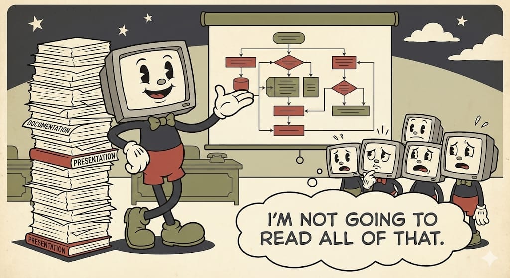
And if you try using a general-purpose AI tool like ChatGPT or Claude to generate a diagram? You're in for a long prompt engineering session. You need to be really prescriptive about exactly what you want. It takes multiple iterations. You're essentially doing the design thinking through conversation, which defeats the purpose.
So you’re stuck staring at text on a page… or are you?
Napkin AI just does the thing.
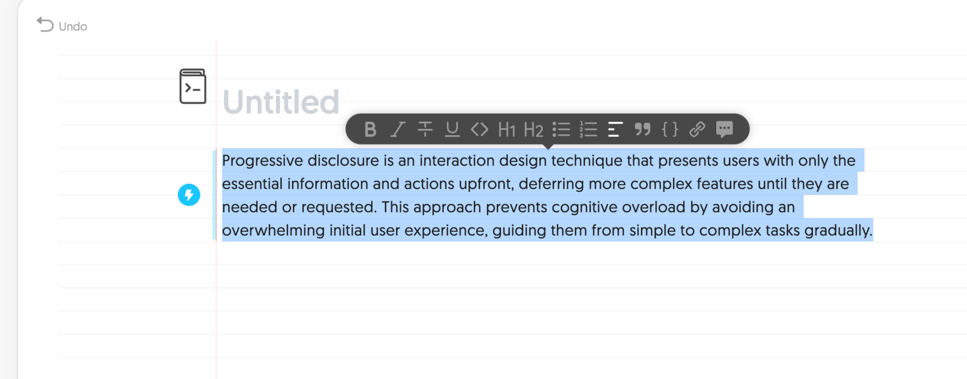
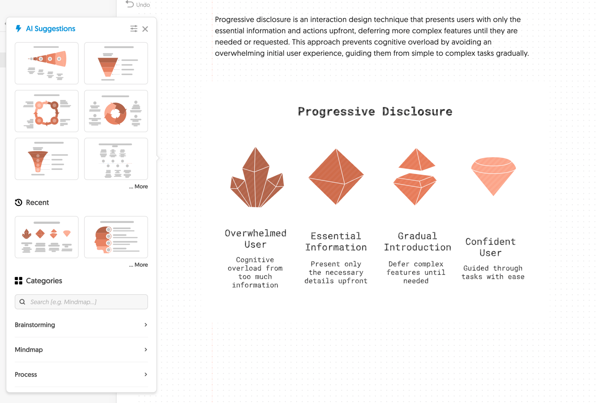
You write your text in their notebook interface. It looks like an actual notebook—infinite canvas, spacing, lines. You highlight the text you want to visualize. You click the button.
Immediately, it generates a visual. Not just one option—it gives you the best default plus several alternatives. The AI is analyzing your text, identifying the core concepts, determining which information design patterns fit your content, and generating multiple variations.
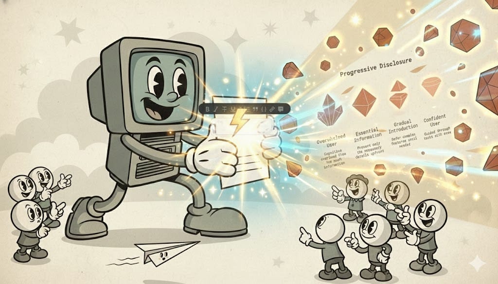
Let's say I highlight text about progressive disclosure in UI design. It generates a funnel showing information flow from broad to specific. Or a hierarchy showing how details nest within categories. Or a process flow showing the user journey. All of them make sense for the content. All of them use familiar visual patterns people will recognize.
The first option is almost always good enough. But if you want alternatives, they're right there. Different categories—hierarchies, processes, comparisons, timelines. They show you the best option first, then let you explore if you need something different.
If the first option works—and it usually does—you just download it or copy it to your clipboard with transparency already applied. Paste it into your doc and move on. If you want to tweak something specific, like changing an icon, the tools are there. They even have an icon recommender that suggests alternatives within context. But most of the time, you don't need them.
The AI is doing sophisticated work behind the scenes—understanding information design principles, matching content to visual patterns, generating coherent diagrams with proper labeling—but you never feel like you're working with AI. You're just creating a visual for your concept.
What makes this stick: it solves the "I need a visual but I don't know how to design one" problem that happens constantly in knowledge work. You give it your text, it handles the information design expertise you don't have.
Honorable Mentions
Wispr Flow makes voice-to-text actually useful. Hold down a keyboard shortcut, speak, release—and clean, properly punctuated text appears wherever your cursor is. Any app, any context. The UX detail that matters: it's a hold-to-talk shortcut that works system-wide, so speaking becomes as convenient as typing but significantly faster.
Granola solves meeting notes without the creepy bot. It runs locally, detects when you're in a meeting from your calendar, and captures audio from your machine—no visible participant joining the call. You get automatic transcription and summary when the meeting ends, plus the ability to search across conversations and ask questions about what was discussed. The UX that makes it work: it's invisible until you need it, and the documentation just happens in the background.
Supercut is screen recording without the editing tax. Record your screen, then choose your layout after the fact—split screen, bubble, whatever works best. One click runs auto-edit to remove filler words and awkward pauses. You get a polished, shareable video the moment you're done recording. It's a step above Loom with a smoother experience and better performance.
The Pattern That Makes These Work
Here's what these six tools have in common:
They meet you where you're at. You don't need to prepare your input in a specific format or structure it a certain way. You give them whatever you have—scattered sources, rough text, a concept you're trying to explain, a meeting that's happening, a screen you need to record—and they work with it.
They take whatever you can give them at the time. There's no extensive setup. No configuration screens. No decisions about settings or parameters. You're not spending mental energy on how to use the tool. You're just using it.
They leverage expertise, knowledge, and assets on the backend to give you something valuable quickly. NotebookLM understands how to synthesize information into narrative audio. Gamma knows design principles for effective presentations. Napkin AI has deep knowledge of information design patterns. Granola knows how to extract key points from conversations. Supercut understands video editing patterns and natural speech rhythms. Wispr Flow handles speech recognition and text formatting. They apply that expertise automatically so you don't have to.
They save you time and brain power. This is the critical part. These aren't tools that shift work from one form to another. They actually eliminate work. The synthesis work. The design work. The structural thinking about how to present information. The note-taking. The video editing. The typing. That work still happens—it's just happening automatically in the background.
They make AI invisible. You never feel like you're "prompting an AI" or "working with an AI tool." You're creating an audio summary. You're making a presentation. You're visualizing a concept. You're getting meeting notes. You're recording a video. You're speaking and getting text. The technology is completely transparent to the task.
They stay out of your way until you need them. None of these tools demand constant attention. Granola can run completely invisibly. Wispr Flow sits in the background until you hit your keyboard shortcut. Napkin AI sits there until you have text to visualize. NotebookLM doesn't interrupt your workflow—it just makes outputs available when you're ready. The tools are present when useful, invisible when not.

Why This Matters
We're going to see a lot more AI integrations and AI-native products over the next few years. Most of them won't stick because they'll focus on showcasing AI capabilities instead of solving real problems in ways that feel natural.
The ones that succeed will be the ones that understand this pattern. They'll take common, high-frequency problems that eat time and brain power. They'll meet users where they're at, accept whatever input users can provide, and leverage backend expertise to create something valuable immediately.
They won't feel like AI products. They'll just feel like products that work like magic. At least until we get used to it and then it’s still just a good product experience.
That's what makes AI UX actually stick.